New in Omlet: A home for your custom charts with Saved Dashboard 📈

Patrick Suzuki

Hello! 👋 Patrick here — Product Manager for Omlet. We’ve been listening closely to your feedback and we’ve loved hearing how Omlet has helped you analyze and understand component usage across your teams and projects, while also giving you data to optimize and evolve your design system.
I’m excited to share a new feature that helps you collect, reuse, and curate the custom analyses you create in Omlet — Saved Dashboard.
Saved Dashboard — a home for all your custom charts 📊
Omlet now has a dedicated dashboard for your saved charts. With Saved charts, you can easily save any custom analysis you create in Omlet to a dedicated collection of insights that you can revisit, anytime. ✨

How Saved Dashboard Works
Saving charts to your Saved Dashboard
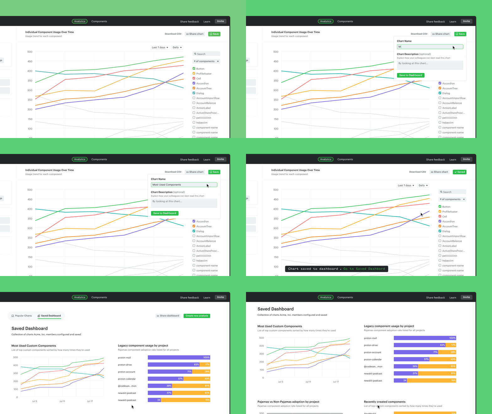
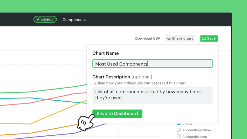
When you’ve created a custom analysis in Omlet, like tracking the progress on removing deprecated components, you can click to ‘Save’ it at the top right. From there, you can give your chart a name and an (optional) description so your teammates can understand the context.

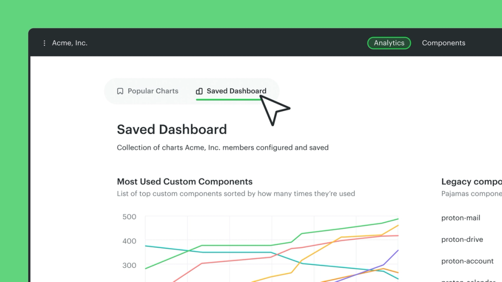
Once you’ve saved your custom chart, it’ll go to your “Saved Dashboard” — a new dedicated view in the Analytics tab that’ll hold all of your saved charts. Omlet’s pre-built charts will continue to live in the “Popular Charts” dashboard right next to it.
Here’s what that looks like.

Coming soon: sharing charts with your team
Many of you told us that you’ve been sharing Omlet’s insights regularly within your product and engineering teams, reporting the progress to your leads. Stay tuned for a follow-up update that’ll make sharing charts from Omlet much easier. ⌨️
Go ahead and try out the new Saved Dashboard in your Omlet workspace. We’d love to hear your thoughts about it or anything else you’ve been using in Omlet: hi@omlet.dev.
Saved Dashboard is available on the Advanced plan, and you can try it for free with our 30-day free trial. And if you’ve tried Omlet before and want to give this new feature a look, contact us.